Clearing Up a Gray Area: How a Color Contrast Checker Can Improve Web Accessibility
 Mar 30, 2022

Author: Level Access
As the public (and legal) understanding of digital accessibility expands, more and more organizations are recognizing that accessibility starts with design. Level Access’s Principal of Accessible Design, Karen Hawkins, covers this very topic in our webinar about embedding accessibility in your style guide. One accessible design issue Hawkins spotlights in the webinar is color contrast. And that’s no surprise, since color contrast is one of the most commonly overlooked accessibility issues in web design. In fact, it has consistently been named a top conformance issue within the Web Content Accessibility Guidelines (WCAG), the global gold standard for web accessibility.
It takes careful work to ensure color contrast ratios meet web accessibility standards. Fortunately, from what we’ve observed in our designer-focused webinars, there’s plenty of enthusiasm to do it. Keep reading to learn more about why color contrast matters, how to design with contrast in mind, and how a color contrast checker can help.
Why color contrast matters
As mentioned, color contrast is a common WCAG conformance issue. WCAG is the widely accepted standard for designing accessible web content (learn why on our WCAG page). The guidelines clearly indicate that color contrast is crucial to a person’s ability to perceive, understand, operate, and interact with a website or app.
Color contrast is a design and accessibility issue that truly impacts everyone. First, it’s an important consideration from an inclusion standpoint. Millions of people around the world have some type of vision impairment. People with presbyopia (difficulty focusing on close objects), low vision, or blurred vision may have particular difficulty with low color contrast. Individuals with color blindness (there are several types), will also be impacted, as they often struggle with, or are unable to perceive page elements that don’t sufficiently contrast with their backgrounds.
Cognitive conditions that impact a person’s short-term memory or ability to maintain focus can also make using hard-to-see, low-contrast text challenging and frustrating. In addition, vision typically declines with age, and new visual impairments, such as those caused by macular degeneration, can emerge, making color contrast a crucial consideration for older users as well.
But no matter what your level of vision, it’s much easier to see black text on a white background (or white text on a black background) than light gray text on a white background. Even users with perfect vision may struggle to perceive low contrasts when in certain environments. For example, low contrasts become even more challenging outdoors in bright sunlight, or when using an old computer monitor with different color calibration settings.
Design with contrast in mind
Understanding the importance of color contrast is only the first step toward designing web content that uses color in more accessible ways. The next step is applying that understanding to the design process from day one. The best place to start, as with most other accessibility considerations, is the WCAG criteria.
What WCAG says
WCAG defines its standards as success criteria, and these are categorized into one of three levels: A, AA, or AAA (learn more about WCAG conformance levels). Level A conformance represents the bare minimum of accessibility, while level AA includes and expands on level A criteria. Level AAA is the highest standard of accessibility, but not all level AAA criteria are easily achievable for all sites. For this reason, we recommend most organizations strive for level AA conformance in order to meet legal accessibility requirements.
WCAG has three level AA criteria pertaining to color contrast. Two of these criteria identify the minimum contrast ratios for certain text and non-text elements of a web page. White text on a black background, or vice-versa, represents the highest possible contrast — but of course, most brands want the freedom to use more colors than just black and white. That’s why it’s so important to understand the following WCAG criteria regarding color and color contrast.
1.4.3 — Minimum Contrast
In this requirement, the contrast ratio between text elements (both text and images of text) and backgrounds must be a minimum of 4.5 to 1. For interactive text like hyperlinks, this ratio applies to all states: e.g., default, hover, focus, and visited. Large text, however, only needs to have a ratio of 3 to 1. “Incidental” text (text that is nonessential to understanding or purely decorative) and logotype text have no contrast ratio requirements. This is a level AA criterion from WCAG 2.0.
1.4.11 — Non-Text Contrast
While criterion 1.4.3 covers text elements, 1.4.11 covers non-text elements. These are defined as user interface components (such as buttons and graphical objects) that are required to understand the content (such as images or infographics). The required contrast ratio for these non-text elements is 3 to 1. As with interactive text elements, remember, the 3 to 1 ratio applies to all states of a user interface component such as a button in its active, inactive, hover, or clicked state.
Success criterion 1.4.11 comes from WCAG 2.1. You can read more about WCAG version updates in our blog on WCAG 2.2.
1.4.1 — Use of Color
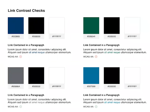
Criterion 1.4.1 is a WCAG 2.0 AA criterion that remains relevant despite more recent WCAG updates. It states that designers should not use color as the only visual means of conveying information, indicating an action, prompting a response, or distinguishing a visual element.For example, consider a website in which the only thing distinguishing a hyperlink from the text around it is the color of the hyperlink. Someone with low contrast sensitivity or certain types of color blindness may be unable to detect the difference between what is linked and what isn’t, and therefore struggle to utilize the content. Using another indicator, such as underlining all hyperlinks, fulfills criterion 1.4.1 and makes the link perceivable for more users. It also makes performing a color accessibility test easier, as we’ll soon cover in more detail.
Why you need a color contrast checker
A color contrast checker, sometimes referred to as a web accessibility color checker, is a must-have for designers who are ready to “shift left” when it comes to web accessibility by involving more than just developers in the process of creating accessible web content. It’s not developers, but designers who own color, so designers also own contrast. Web accessibility color checkers make testing the color elements of your website against WCAG faster and easier, creating actionable data that can be recorded and used to design your website with adequate color contrast in mind from day one.
What is a web accessibility color checker?
A web accessibility color checker is a tool that checks the color contrast of your site against the WCAG criteria described in the previous section. There are several easy-to-use color contrast checker tools online, such as WebAIM, Contrast Ratio, and Tangaru Contrast Finder. Using one of these tools, you’ll input all color combinations you’re considering for text and non-text elements. The checker will then output the contrast ratio of each and, generally, whether it passes the relevant WCAG criteria.
While this is a largely manual process in which you’ll need to test and record each color combination, the effort is worth it. Once you’ve found all the color combinations that pass WCAG criteria, you’ll be able to document them in your style guide and ensure accessible color contrast is built into the foundation of your digital content moving forward.
How to use a color contrast checker to perform a color accessibility test
- Use the web accessibility color checker to identify and check all color combinations you’ll be using for text elements and essential non-text elements of your digital content. In other words, check every single color against every single color. Remember to include all states of an interactive element, such as the default, hover, focus, and visited states of a button or hyperlink.
- If color is the only marker for hyperlinks contained within other text (e.g., in a sentence or paragraph of text that is non-hyperlinked), you will need to perform a three-way color accessibility test for your text colors. That is, you’ll need to make sure the contrast between non-interactive text and background, the contrast between hyperlink text and background, and the contrast between the non-interactive text and hyperlink text are all 4.5 to 1. If your hyperlinks are always underlined, you don’t need to perform this three-way check.
After using the web accessibility color checker, document all workable color combinations and include them in your style guide. You can use our free template tool to organize and document your results. This saves trouble later if, for example, a new design is implemented that changes the background color of your site.
When all workable color combinations have been documented up front, designers can simply check any proposed changes against the style guide before implementation to make sure the new design conforms to WCAG color contrast standards. In fact, some brands may need to revise their colors for digital experiences from the get-go. Often, this requires only subtle changes. A color contrast checker makes it easy for creative teams to tweak brand colors with combinations they know will meet contrast requirements. 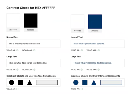
Additional tips for color in accessible web design
Considering color in accessible web design goes beyond contrast ratios. The following quick tips can help you make the use of color in your web content as accessible as possible.
- Don’t use ultra-light gray for text. Light gray hues tend to have low contrast with backgrounds that are white or light in color.
- Don’t use yellow for stars in star reviews. Like ultra-light gray text, yellow can be hard to see on a white or other light-colored background.
- Don’t use color as the sole indicator of meaning. This makes it difficult for people with low contrast sensitivity or in certain environments to fully understand your content.
Join the movement for accessible design
Organizations of all sizes are becoming more enthusiastic about embedding accessibility into the design process, but it’s understandable if this “shift left” feels intimidating. At Level Access, we’ll work alongside you to help identify and prioritize manageable first steps. Reach out to our team today to find out how we can help ensure your web content serves everyone—without sacrificing style.
Share

Subscribe for updates