Five most common accessibility errors in software design and development
![]() Sep 2, 2021
Sep 2, 2021

Author: Level Access
Digital products start as a great idea, and make their way through analysis, design, implementation, and testing. But all too often accessibility considerations are overlooked. What defines digital product or software accessibility? Basically, accessibility-built software is human-centered. It’s designed, created for, and usable by everyone —- including people with vision, hearing, dexterity, mobility, cognitive, and learning disabilities.Proof of accessibility comes in the form of a VPAT (Voluntary Product Accessibility Template). VPATs use the Web Content Accessibility Guidelines — or WCAG — as the standard. So how do designers and developers prevent introducing accessibility barriers? The WCAG guidelines are a good place to start.Based on WCAG standards, in this article, we’ve identified five of the most commonly made software accessibility mistakes, offering solutions for fixing or avoiding them all together.
Common digital product and software accessibility errors
1. Insufficient color contrast
Low color contrast is the most common accessibility issue in digital product design, and one of the easiest to avoid or to fix. Contrast is the difference in color between something in the foreground and its background. Many common UX and UI design practices do not pass WCAG standards when it comes to color contrast standards, so it’s best to be mindful of them early in the design process. For example, using light grey text to indicate inactive fields may not meet contrast requirements making the UI more difficult to use.As another example, consider text on a button. If the contrast between the text color and the button color aren’t different enough, a user may not be able to read the text, or the text may be blurry. And the impact is significant. Vision disability is one of the top ten disabilities among adults, impacting approximately 12 million people. 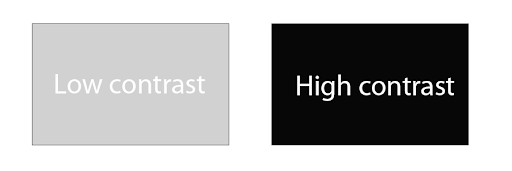 When creating design standards that will be woven throughout the interface, color choices are an important consideration. WCAG 2.0 Level AA guidelines require a color contrast ratio of at least 4.5:1 to make most text legible (with a 3:1 ratio for large text). Being aware of this guideline, designing for it where possible, and allowing users to adjust contrast settings will help prevent the issue of lack of readability due to low color contrast.
2. Lack of keyboard access
Keyboard accessibility is another important consideration that can significantly impact software accessibility and usability. Keyboard access ensures that a user can operate the experience using just the keyboard or a keyboard interface. Some users have tremors or dexterity issues that prevent fine muscle control or use of a mouse. Others might have little or no use of their hands, or are blind and rely on assistive technology to access a keyboard for navigation. WCAG guidelines require that functionality is operable through a keyboard without requiring specific timings for individual keystrokes. That is, a user should not be required to hold down a key or make multiple keystrokes within a certain amount of time before the keystroke is registered. When it comes to supporting keyboard access, be sure to check your navigation menus and submenus, forms, submission buttons, media players, sidebar content and embedded content. A user should be able to “tab” to each of these elements in a logical flow (such as left to right and top to bottom), with the ability to select, or activate a feature, at any time.Common keyboard interaction and corresponding keystrokes:
- Navigate to an element: tab (shift + tab to navigate backward)
- Activate a link: enter
- Activate a button: enter or spacebar
- Checkbox: spacebar
- Radio buttons: up, down, left, right arrows (tab to move to the next element)
3. Lack of visible or obvious focus
Visible, or obvious, focus helps a user understand which element has the keyboard focus, and is another WCAG accessibility requirement. Anything interactive should have a focus indicator, which is visible focus ensuring the user knows exactly where they are at any time when tabbing through content. Well-designed focus indicators should be high contrast, the same throughout an interface, and consistent regardless of the browser. Focus is obvious to a user when a blue (or similar) outline is visible, or when highlighted fields appear as a user fills out an online form or tabs through menu options.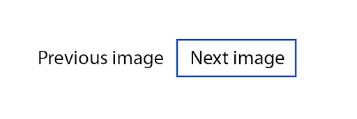 As with other digital product accessibility features, it’s easier and more efficient to design and create focus indicator styles for elements early in the process, preferably at the same time as other states (like hover and active). If you want your software design to reflect a consistent look and feel, it’s worth the effort to define standards and document a style guide for designers and developers to follow.
4. Lack of image descriptions or alt text
Software can be rich with images, and many of them may have missing or inaccurate image descriptions — or alt text. Lack of this description means that users who rely on assistive technology, such as screen readers, won’t be aware of what those images are. This can be more of a problem if the image is essential to understanding the meaning of the content on the page. Missing alt text is another common WCAG accessibility issue that is easy to fix. When clear and concise alt text and image descriptions are provided, screen readers can read the image description when the user hovers over it or interacts with it, and the user has a better understanding of the full meaning of the content.Alt text is particularly important when images contain information essential to the user, or for operation of the interface (such as instructions for use, supporting statistics, or purchase details of an item). It can take a detailed eye to find where an image needs alt text to be useful. For example, in a recent lawsuit, a shopping cart icon lost its “View Cart” text in responsive views and didn’t have alt text making the button unusable for mobile screen-reader users. Alt text can either be presented within the alt attribute of the image itself or within the context or surroundings of the image. If the description is included in the surrounding content, an empty alt attribute is acceptable.
Another exception to including image alt text is for those images that are decorative only. That is, images that are not essential to understanding the content on the page. Because most alt text is subjective, it takes practice to create effective descriptions, especially when a link to additional content is embedded under the image. It helps to ensure that anyone contributing graphics, photographs or other images to the design is aware of how and why they need to provide a brief, clear description of the images they provide. Including this expectation in a software design procedure and user testing plan will help ensure that all content on the page, including images, is accessible for individuals with disabilities.
5. Improperly labelled controls
Software form controls include objects that users interact with, such as buttons, checkboxes, and text fields. Form controls must be properly labeled so that users understand the purpose of the control. Keep in mind, a label may be visually labelled next to the control or hidden and only available for assistive technologies.While some controls are clear because of their label (for example, “Next Page” or “Submit” buttons), other controls might create confusion or problems with use if the labels are missing. For example, a screen reader or other assistive device might not be able to detect how to select a date if the “date” field or drop-down menu is not labelled clearly or accurately.Proper placement of control labels should also be part of design choices that consider software accessibility. Typically, most labels are placed to the right of radio buttons and checkboxes and to the left, or directly above other types of form fields. The goal should be to maintain a close and distinct visual relationship between the label and the form control. Maintaining consistency helps ensure that your product is logical, understandable and intuitive for your users.
Software accessibility testing
Users will interact with your content at different sizes and formats, from handheld consoles to 4k televisions. With all of these accessibility features implemented, don’t forget to test them on a range of devices, operating systems, and assistive devices to make sure your software and its features are, in fact, accessible.
The business case for software accessibility
Creating accessible software ensures the interface is usable to the largest possible audience. It can also impact your profitability. Organizations are increasingly requiring proof of product accessibility in their RFP processes, including those in the private sector. This proof comes in the form of a VPAT, which details your level of conformance with applicable accessibility standards. Further, companies are being sued for inaccessible digital experiences. Integrating an inaccessible software or digital product opens that company to tremendous legal risk.
How eSSENTIAL Accessibility can help
Getting your digital product or software accessible and keeping it that way is an ongoing process. Content changes, features are updated, and accessibility standards and regulations evolve. Accessibility considerations, as a best practice, should begin with design and remain through every feature release. eSSENTIAL Accessibility is uniquely positioned to offer this comprehensive, sustainable approach. We take a holistic review of your product and support your team throughout every stage of the development lifecycle. We test software usability with assistive technologies and with assessors who have disabilities. We compile a comprehensive audit report that identifies and prioritizes failures. We then provide you with the tools to fix identified issues and the training to prevent new issues from being introduced. We regularly monitor for any new failures that may arise in the development cycle, and we start the process again with new releases. We also understand the complexities in procurement processes and we work with you to help you meet RFP requirements, delivering a completed VPAT, or ACR. If you’re ready to get started with software accessibility, or want to request a demo of our Accessibility-as-a-Service solution, engage with our team today.
Share

Subscribe for updates