Designer Tips: Improving Button Accessibility
 Sep 7, 2023
Author: Level Access
Buttons play a pivotal role in a range of digital experiences. Whether you’re shopping for typeface books online, signing up for a UX newsletter, or logging into your Figma account, you’ll need to use at least one button.
If you’re a designer, that probably isn’t all too surprising. Since buttons are so common you run into them regularly, so why spend a whole blog learning about them? The answer: accessibility. Buttons help users navigate and engage with your digital experience. They’re core to its success. And since buttons are such an important part of most digital experiences, it’s essential for designers to ensure that buttons can be used by everyone, including people with disabilities who may use assistive technology, like a screen reader, or alternative navigation methods, like relying on the keyboard only.
Sometimes starting can be the hardest part, so in this article we’ll be discussing three key aspects of button accessibility you can take forward and start implementing in your designs today (or tomorrow, after you’ve revisited your style guide).
1. There’s a difference between buttons and links
While buttons and links might not seem all that different, there is a subtle distinction between them that can make or break an end user’s experience.
At a basic level:
- Buttons are interactable elements that perform actions on a page; they do something.
- Links are interactable elements that direct you to different parts of the experience; they take you somewhere.
Whether or not you’ve thought about it, you probably already know this. It’s why your buttons and links likely don’t look the same: they each communicate something different to the user!
The only issue with this approach is that some users can’t perceive those visual differences, and need to rely on other ways of knowing how to interact with your element.
This is where the conversation for designers usually ends and developers are told to ensure they give buttons the role of <button> and links the role of <link> in their code. This is great advice, but it doesn’t mean designers don’t have a voice here.
We know a lot of designers want and need creativity and flexibility in their designs, which can sometimes mean a link could look like a button, or a button could look like a link. In these scenarios, it’s essential that designers communicate the intent of their designs to developers.
If a developer thinks your design looks like a button, they might improperly define it as a button in their code. If this happens, a screen reader user could select what they thought was a button and be redirected to a completely new page in your experience (i.e., the behavior for a link).
This unexpected outcome of being sent to a new page can be completely experience-breaking for users.
So, your first button tip is: If you think any of your button designs could be mistakenly interpreted as a link, make sure you connect with your development team so they know to communicate your design intent correctly to your users.
2. Color contrast is key
If you’ve landed on this blog, chances are you’ve probably already read a thing or two about color contrast and accessibility, so we’ll keep this section brief.
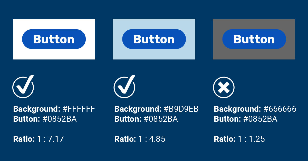
When it comes to color contrast on buttons, there are two handy best practices to remember :
- You should check the contrast between the text and your button.
- The contrast ratio between text and its background should be at least 4.5:1.
- You should check the contrast between your button and its background.
- Optimally, the contrast ratio between a button and its background should be at least 3:1.
(Note: These are according to the Web Content Accessibility Guidelines, or WCAG, Level AA standards, which are the most commonly targeted standards for most organizations.)
While many designers know they need to check the contrast of text, it’s just as important to remember to also check the contrast of the button itself. Without proper contrast, your users may have a hard time finding and interacting with certain functions of your experience. This can be especially true for the millions of people with some form of visual impairment or color blindness and some users with cognitive disabilities that can find low-contrast text difficult to focus on.
For bonus points, it’s a good idea to check the contrast of the button and its background for every button state. If your button changes color when hovered over, for example, that new hover color should also meet the minimum 3:1 contrast ratio.
3. Aim for the right target (size)
It probably won’t surprise any designer here to learn that buttons need to be large enough for your audience to interact with, particularly when those experiences could be accessed on a wide variety of devices and screen sizes. But do you know exactly how big they should be?
Our trusty accessibility guidelines (WCAG) tell us the minimum target size for buttons should be at least 24 x 24 CSS pixels (which can include your button and the padding around it). This sizing helps ensure users with various motor and visual disabilities are able to access different components on your site.
Bullseye! Mystery solved, right? Well, not quite. The WCAG accessibility guidelines provide different levels of conformance targets, and the 24px minimum is just the Level AA conformance target. Organizations like Apple and Google recommend the Level AAA target of 44 x 44 CSS pixels (in Google’s case, they recommend 48 x 48). So, if you’re looking to adhere to their recommendations, 44 x 44 should be your minimum target size.

To ramp up the creativity just a bit though, there are a few notable exceptions to these guidelines for you to consider.
At a high level, you may be able to design buttons smaller than 24 CSS pixels if:
- There are no other targets within 24 CSS pixels of your button in all directions.
- The user can perform the same action elsewhere on the page in an accessible way.
- The actionable element is inline (this exception is frequently used for inline links).
- The size of your button is set by the user agent.
- Your buttons’ size and location are considered “essential.”
- To use a direct quote from WCAG: “If the size and spacing of the targets is fundamental to the information being conveyed, the Essential exception applies.”
- An example of this could be several pins placed on a map that may overlap with one another. Overlapping isn’t a best practice, but the location of the pin is essential to the experience.
So, your third button tip: your buttons should be at least 24 x 24 CSS pixels in size, but you should aim to have them be at least 44 x 44.
Better buttons for all
In this article we’ve discussed the importance of ensuring the intent of your buttons is properly communicated, reviewed tips on color contrast to ensure buttons can be properly perceived, and talked about button target size to ensure buttons can be interacted with. Now, it’s up to you.
The next time you’re working with buttons, try giving at least one of these tips a try. Even a small improvement in button accessibility is a step toward creating a more accessible, more robust, and ultimately stronger experience for each and every one of your users.
If you’d like to learn even more about accessibility for buttons and links, we have an entire Academy course dedicated to exactly that subject. You can learn more about Academy on our website, or reach out directly for a demo of our Academy or any of our other accessibility tools for designers.
Share

Subscribe for updates